
Friday 24 April 2015
Wednesday 22 April 2015

Saturday 18 April 2015

Thursday 16 April 2015
Wednesday 15 April 2015
Evaluation: Question 5 (Uses and and gratifications)
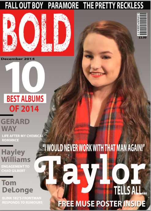
By researching conventions of a music magazine and asking my target audience their ideas about the magazine I was able to target my product carefully to ensure that I meet the needs outlined in the uses and gratifications theory.
Tuesday 14 April 2015

Monday 13 April 2015
Sunday 12 April 2015
Saturday 11 April 2015
Thursday 9 April 2015
Audience Response(Double Page)Question 2
What did you think of the colour scheme used in the Article?
Audience Response(contents page) Question 2
Can you tell the contents page is from the same magazine as the cover? how?
Audience Response(contents page) Question 1
What do you think of the way the contents page is set out?
Sunday 5 April 2015
double page coulour scheme
For the colour scheme of the double page I used blue, white and black. I used these colours because I wanted the article to be separated and stand out from the colour scheme of the rest of the magazine, which is red, white and black, however I waned to to keep to the house style so that it was clear that it still came from the magazine. To do this I kept the black and white as these are simple but bold colours and then used the main colour as blue and used some of the fonts which as featured in other pages of the magazine.
Subscribe to:
Posts (Atom)